Celia Sawyer, founder of Celia Sawyer Interior Architecture and Design and member of the International Property Awards judging panel
The key is to create a focal point. This is the area where your main seating area will go, and is generally a fireplace of sorts. It is traditional to place seating around a fireplace and this creates a warm and inviting area whatever the size of the room. A living room without a focal point, lacks any warmth and feels wrong.
The Fairways London project was a whole house design from the ground up, but the main reception room was the client’s most important room, as this was a Saudi Royal and the standard had to be super high luxury for her. The reception needed to have a very feminine style and elegance, so that it was comfortable and functional for her needs.
We used silk rugs inlaid into the marble flooring, and the most beautiful crystal wall lights and ceiling lights which were over 1.5 metres in diameter each end of the room. The house was to be bright and airy and, as it was such a large room, I formed two ends. One had a slightly more classical look with curved sofas and chairs and a traditional fireplace, while the other end echoed the colour scheme but with a slightly more masculine feel, with clean lines and taller armchairs.
The theme had a slight art deco feel to it and all the furniture in the reception room was bespoke, even the large mirrors on the walls. I also softened the room with an array of silver, elegant flower vases filled with fresh flowers. We installed a grand piano for the Princess to sit in the window bay and to separate the two ends of the room. All the materials used were of the highest quality, from leathers, through to silk on the cushions and beautiful crystal on the tables.
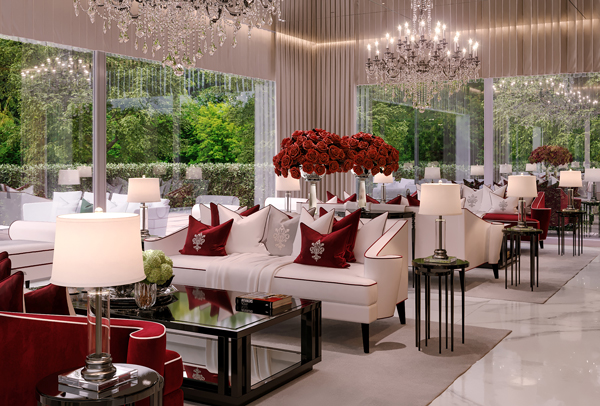
The owner of the large country house project is a successful businessman who wanted his wife to have a huge contribution to the reception room. Her favourite colour is red and, when I was asked to use this as a main colour, I was a little worried. I also know that red isn’t one colour, there are many variations. Had I only used very small elements of red, the room would have appeared bland and almost fearful of the dominance of such a colour.
I therefore chose to ‘go brave’ and take the whole back wall as the main palette and feature. The flooring was an off-white marble with flecks of silver and beige, as was the architrave around the doors. There was a lot of glass in the room due to large windows, so I felt it could easily take the strength of the red. I installed two huge bespoke crystal chandeliers into the ceiling, as the brief was elegant, modern, with a twist of traditional!
The rugs under the two seating areas were thick pile, which felt glorious underfoot, and I wanted to incorporate the same feel on the feature back wall, using velvet in a deep red. I mirrored this red in the cushions with piping and logos, and also along the sides of the sofas and chairs. The clients wanted to show off their crystal so I designed two large inset boxes, lit up to show this off in the feature wall. These were made up of mirror, glass and silver plate, and as they were over-sized, gave the room a real focal point.
